
Bringing a bold new brand to life across WCG’s digital platform
Transformed two outdated, siloed websites into a unified, editorial-first experience that supports WCG’s repositioning as a clinical research leader. Balanced stakeholder needs, regulatory clarity, and modern storytelling to deliver a scalable platform for sponsors, CROs, and research sites—without feeling clinical.
Bringing Clarity and Cohesion to a Complex Clinical Ecosystem
This wasn’t just a redesign—it was a repositioning effort.
WCG had recently unified 31 companies under one brand and needed a digital presence that could communicate trust, expertise, and scale—without falling into the trap of feeling sterile or overly clinical.
Audited over 30 legacy sites and mapped consolidation points
Collaborated across stakeholders to define site goals and success metrics
Anchored the work in clear principles: trust, usability, and clarity
My Role
Principal Product Designer
Scope
Product Strategy, User Experience, Visual Direction, User Testing, Design Systems
Tools
Figma, FigJam
Untangling Complexity Through UX Strategy
With multiple overlapping audiences and legacy systems, the experience had to support wayfinding, decision-making, and confidence across a dense ecosystem of services and tools.
Conducted journey mapping across sponsors, CROs, and research sites
Reorganized navigation and IA to reduce friction and repetition
Introduced layout patterns that supported comparison, scanning, and conversion
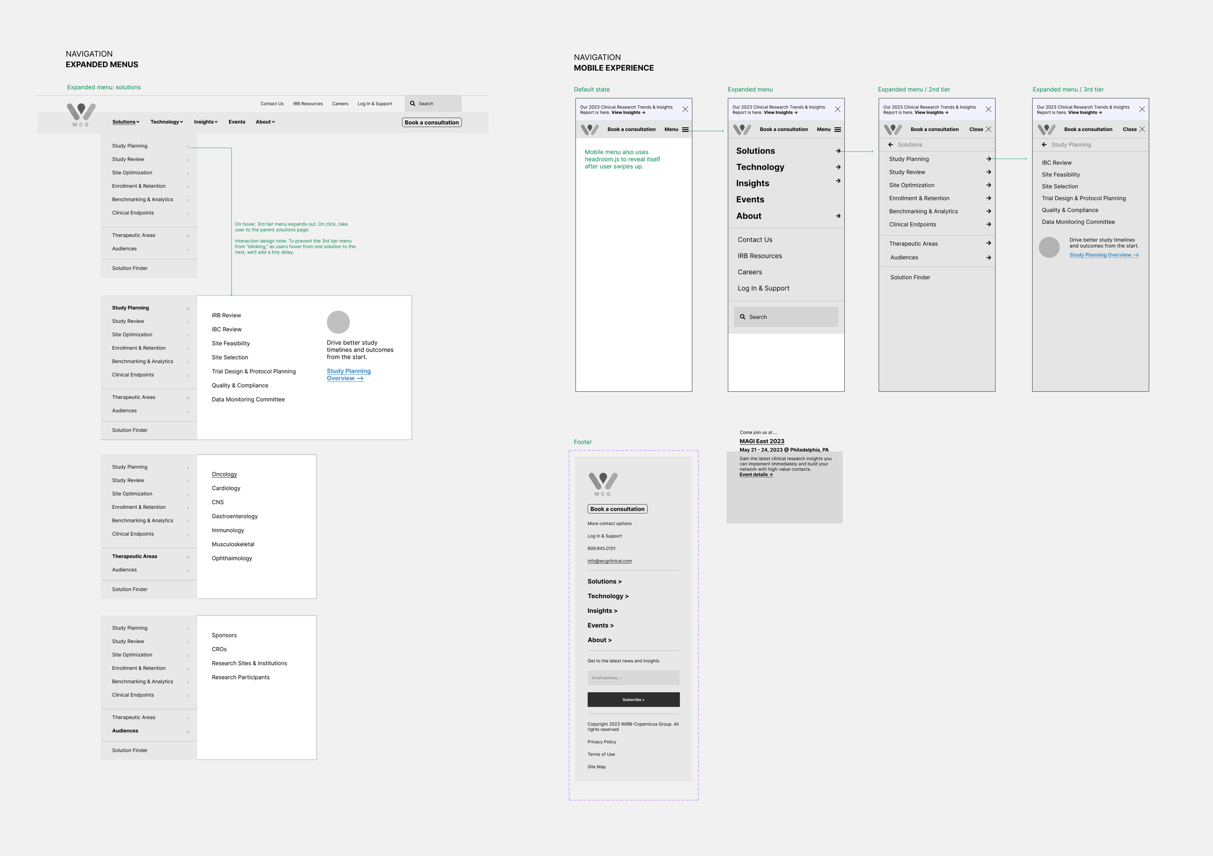
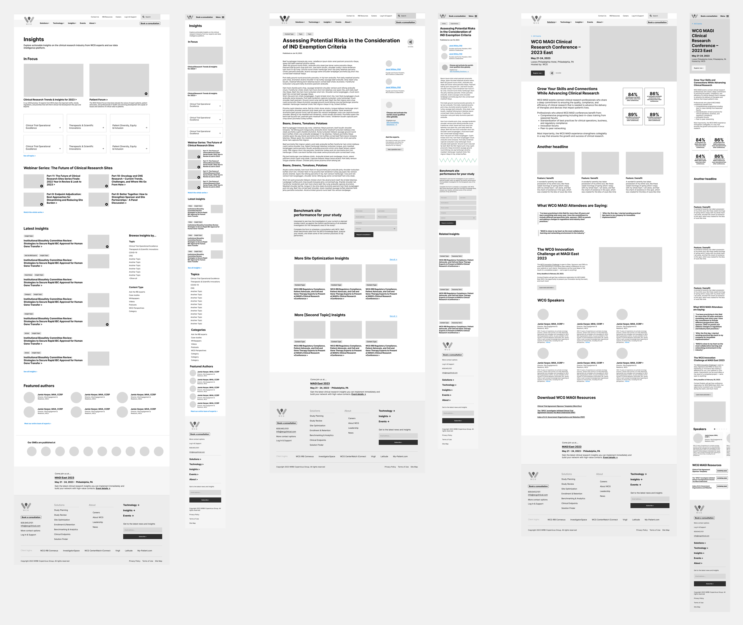
Defining UX Through Wireframes & Page Types
After aligning on structure, we built a wireframe system to support varied content, user needs, and future scalability. Each template prioritized clarity and hierarchy, with page-level flexibility for both short and long-form content.
Created wireframes for service pages, insights, and product overviews
Balanced conversion needs with education and exploration
Designed flexible content regions to support internal publishing
Tested variations for scannability, readability, and content balance
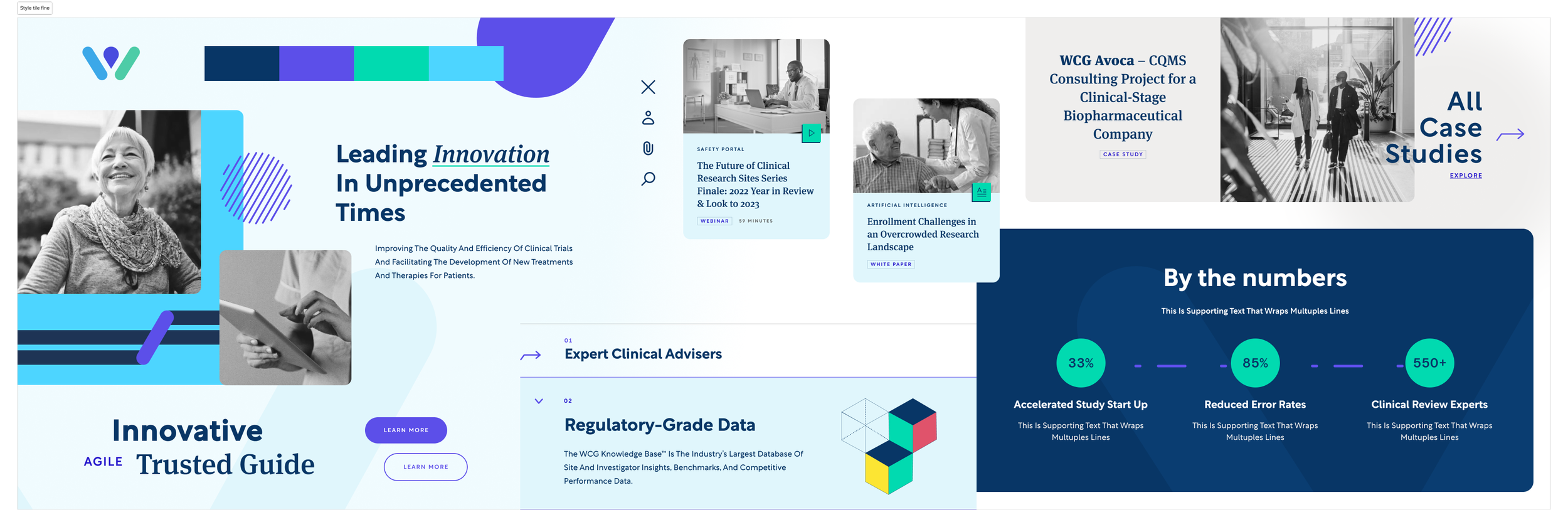
Shaping Design Direction Through Collaborative Exploration
To establish a visual language that felt modern, credible, and not overly clinical, we began with a series of collaborative workshops. Through a Design Shopping session and Spectrum Exercise, we aligned cross-functional teams around tone, ambition, and visual priorities—setting the stage for creative exploration grounded in shared understanding.
Ran a Design Shopping workshop to gather and evaluate external inspiration
Facilitated a Spectrum Exercise to identify tone and expression boundaries
Created style tiles representing three distinct visual directions
Explored variations in layout structure, typography, color, and motion cues
Used style tiles to align on tone before entering full visual execution
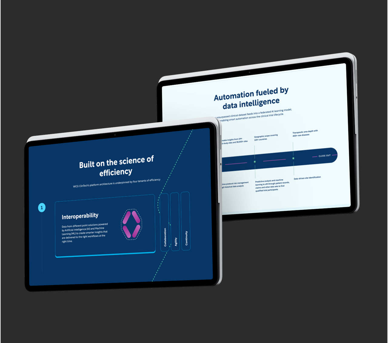
Executing the Final Visual Design System
Once direction was chosen, we applied the visual system across all major templates. The final design emphasized clarity, rhythm, and a restrained boldness—using space and contrast to elevate content.
Designed modular templates to support services, insights, and software
Applied consistent visual hierarchy using type, layout, and overlays
Balanced brand expression with high content density and accessibility
Delivered polished UI for both desktop and mobile, ready for development handoff
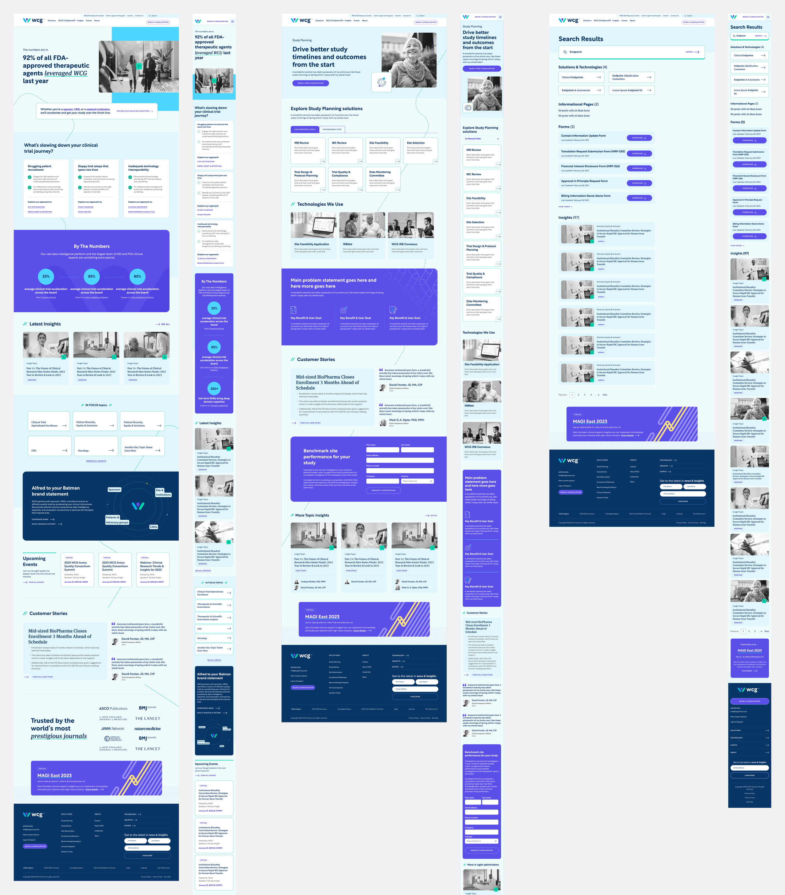
Unified, Intelligent Search
We designed a search experience that surfaces results across all areas of WCG—from solutions and technologies to downloadable forms, insights, and events. Users can quickly filter by content type or functional category, making it easier to locate critical resources without jumping between silos.
Interactive Driven Design
We built motion-enhanced modules to help users explore WCG’s full ecosystem—from clinical solutions and AI capabilities to relevant apps, platforms, and research stories.
Thought Leadership, Streamlined
We designed a flexible insights system to showcase WCG’s clinical expertise and position them as a trusted voice in research. The experience includes filterable hubs, smart visual cues for content types, and scalable templates—making it easier for users to explore relevant topics and for WCG to maintain a consistent, strategic publishing cadence. This shift turned their blog into a cohesive platform for thought leadership.
Most clinical websites play it safe, but WCG gave us an opening to do something more distinct. We knew we had to bring order to a sprawling ecosystem, but we also saw a chance to create a visual language that felt bold, clear, and confident in a space that often feels generic.
It wasn’t just about making things easier to find (though we did that too), it was about building trust through design and giving WCG a recognizable voice across dozens of touchpoints.
Reflection
31
Brands unified under a single digital experience—repositioned through a modern, editorial-first platform.
20+
Custom components designed to support thought leadership, services, events, and gated insights.
Core user roles mapped—each with tailored navigation, content pathways, and entry points into the site.