
Elevating storytelling across a
global brands platform
Starbucks rebranded Starbucks Stories into an editorial platform that could scale across seasonal campaigns, leadership updates, press releases, and human-centered features.
Reimagining Global Storytelling for a Beloved Brand
This wasn’t just a redesign—it was an opportunity to reposition a global brand’s digital presence through storytelling. We were asked to create a flexible system that empowered global teams to publish stories with clarity and cohesion, while preserving Starbucks' iconic brand expression.
Conducted competitive analysis of global editorial and brand publishing models
Collaborated with stakeholders to identify storytelling needs and content workflows
Facilitated cross-functional workshops to align on platform vision and user goals
Defined system objectives: modularity, editorial clarity, and global scalability
My Role
Principal Product Designer
Scope
Product Strategy, User Experience, Visual Direction, User Testing, Design Systems, Accessibility
Tools
Figma, FigJam, Wordpress
Stakeholder Discovery & System Alignment
We kicked off with an immersive discovery phase that aligned business, editorial, and design stakeholders. Our goal was to define the right balance between brand control and content flexibility, ensuring the system could serve everything from campaign launches to community storytelling.
Facilitated cross-team interviews to understand limitations and aspirations
Mapped priorities across brand, editorial, technology
Established shared goals for storytelling and system governance


UX Foundations
Alongside visual exploration, we clarified structural UX patterns that would guide content entry points, page hierarchy, and system reuse. The goal was to ensure stories felt easy to scan, explore, and navigate regardless of format.
Identified key narrative structures across brand, community, and sustainability stories
Simplified global-to-local hierarchy for ease of use
Applied consistent IA to components, page types, and modules
Supported flexible entry points into stories based on business need or user interest

Creative Direction & Visual Language
To align creatively, we hosted a Fueling Creativity Workshop using the Disney Creativity Method, helping us explore bold ideas while staying grounded in feasibility and scale. We paired this with a Design Spectrum Workshop to map stakeholder alignment on brand expression—establishing a shared language and creative direction from the start.
Facilitated two visual workshops to align stakeholders around storytelling potential and brand expression
Used divergent and convergent thinking to explore motion, editorial layout, and component-level flexibility
Flagged early risks around accessibility, performance, and long-term maintainability
Balanced imaginative storytelling with scalable implementation across breakpoints and content types

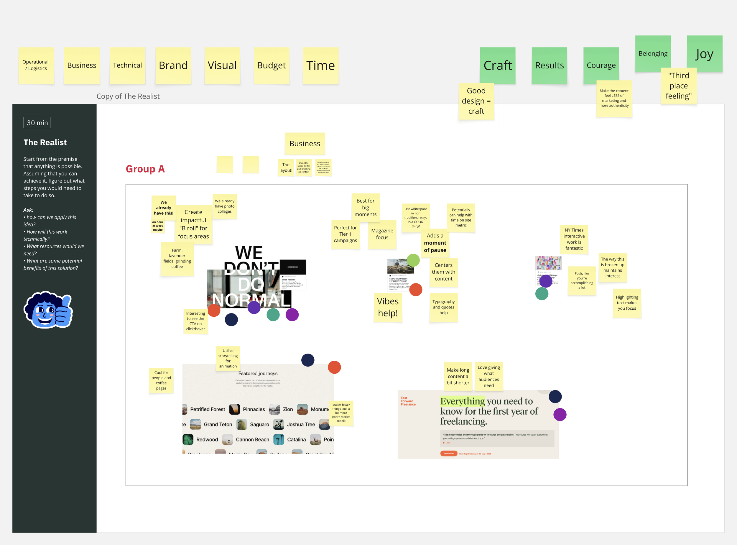
From there, we translated insights into three distinct style tiles—each a motion-rich, system-oriented direction. These weren’t just visual themes, but opinionated, testable concepts packed with theming logic, motion strategy, and component-level exploration. These helped clarify appetite for animation, seasonal variation, and scalable design patterns.
Created three distinct style tiles exploring motion, layout rhythm, and typographic hierarchy
Defined a visual strategy for modular storytelling, seasonal theming, and scalable components
Tested appetite for animation and interaction nuance across the system
Brand Expression
Starbucks’ core values—Belonging, Challenging the Status Quo, and Environmental Stewardship—were expressed through tone, texture, and imagery. The system supported video, testimonials, human-centered photography, and richly detailed components that remained flexible and reusable.

Clean layouts and structured hierarchies with room for mood changes in long-form content, campaigns, and cultural moments. We designed for flexibility—evergreen elements like stats, quotes, and facts could be woven into any story type.
Editorial Clarity

Design System
We codified the visual language into a scalable design system, establishing a flexible foundation through defined typography scales, spacing systems, and responsive behavior. We created consistent component states and motion guidelines, applied accessibility standards for color and contrast, and documented everything in Figma using tokens and theming to support long-term scalability across teams.
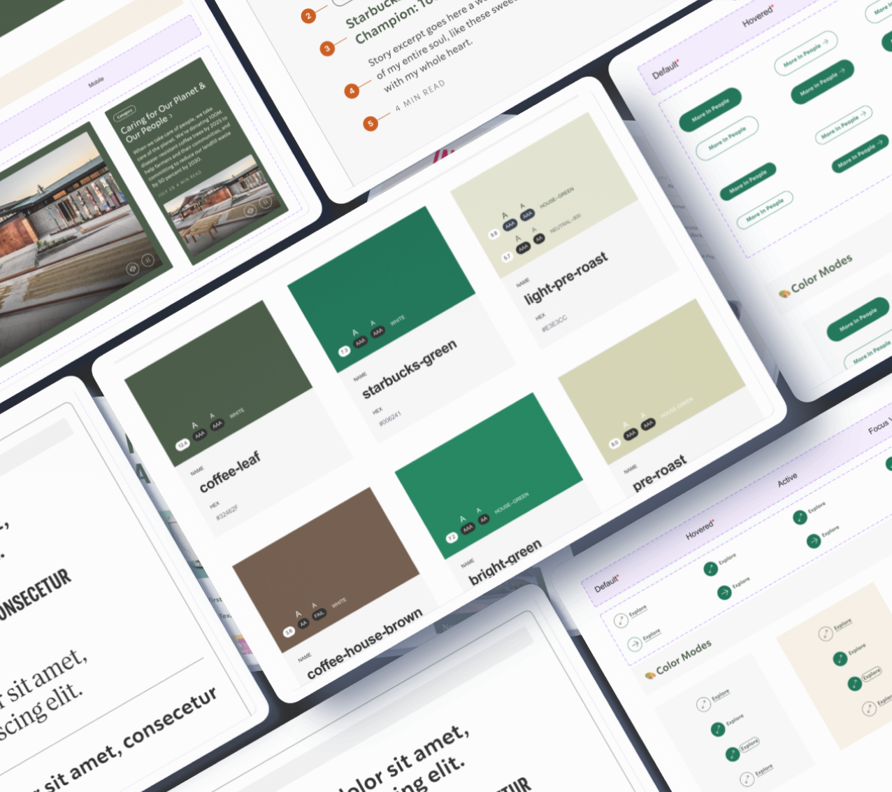
Modularity and Seasonality
I designed for Real-World Consistency, this system had to scale across seasonal campaigns, physical packaging, and in-store signage—requiring careful coordination between digital content and retail rollout teams. The modular framework ensured that both digital and physical touchpoints felt cohesive and adaptable across promotions.

The new system launched on about.starbucks.com with the Red Cup campaign as its first seasonal test.
“We relaunched the Starbucks company website today and I'm very proud of this effort. It was an effort that was driven by data, born out of qualitative and quantitative insights, with a look towards how we can modernize and update. It came out better than I could've imagined.”
Brad Nelson
Starbucks, Global Communications
LinkedIn

This project reinforced how editorial systems can serve not just content—but culture
Designing for narrative flexibility while protecting brand clarity required constraint management, foresight, and a cross-functional collaboration model.
The most rewarding part? Shipping a system that dozens of teams now use to tell more meaningful, values-driven stories at scale.
Reflection
100%
System met full WCAG accessibility compliance in collaboration with Starbucks’ internal accessibility team.
32
Reusable components delivered as part of a fully tokenized design system, supporting editorial storytelling, campaign content, and brand expression.
4
Seasonal color themes built into the system—enabling visual flexibility for initiatives like Red Cup, Earth Day, and Pride without additional dev lift.